Creating a Cohesive (and Unofficial) Design System for AllTrails
AllTrails is a very well-designed website that connects people to the outdoors. It has emerged as one of the leading platforms for trail discovery and navigation. Despite its popularity, the platform has inconsistencies in design and lack of accessibility. Throughout the semester, our team was tasked with addressing these challenges by creating a cohesive design system and documentation that standardizes the experience across the platform and ensures accessibility, while maintaining AllTrail’s “outdoorsy” brand.
For this project, we focused on creating a design system for the web version of the unpaid AllTrails experience.
Task Highlights: I helped design and document components such as breadcrumbs, search, navigation bars, check boxes, and forms and helped set the color and typography for components. I helped develop the guiding design principles and design system branding to ensure they reflected AllTrail’s values and principles.
Role/Team
UX Designer
Team of 3
Timeline
February 2025 - May 2025
Skills
UX Design
Accessibility Design
Design System
UI Kit
Documentation
Usability Testing
Project Management
Tools
Figma
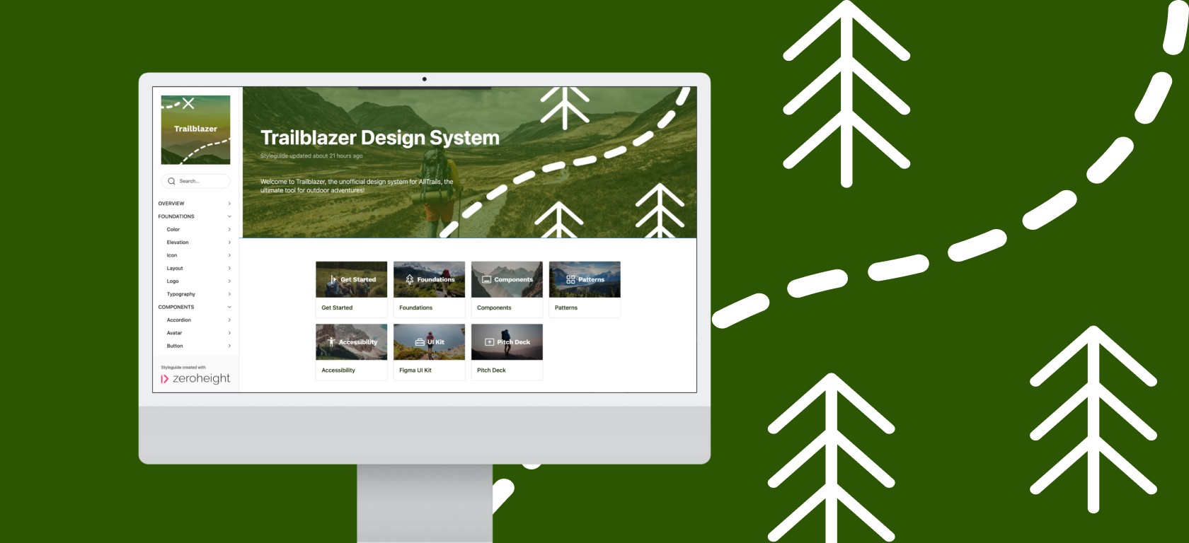
Zeroheight
Figma UI Kit
Zeroheight Documentation Site
About AllTrails
AllTrails is a popular health and fitness app that helps 80+ million outdoor enthusiasts discover and navigate the best trails worldwide. The platform provides detailed trail information, maps, reviews, and images of 450,000 across the world. Through its minimalistic design and advanced information visualization, AllTrails allows users to focus on finding the perfect outdoor adventure. At its core, AllTrails aims to connect people to the outdoors through its platform.
Problem
AllTrails has a strong and consistent “outdoorsy” visual identity throughout the entire platform, however the experience across different flows was pretty inconsistent.
Inconsistent Color Usage
Too many colors with no clear guidance on why and when to use
Different Variations of the Same Component
Multiple variations for a single component

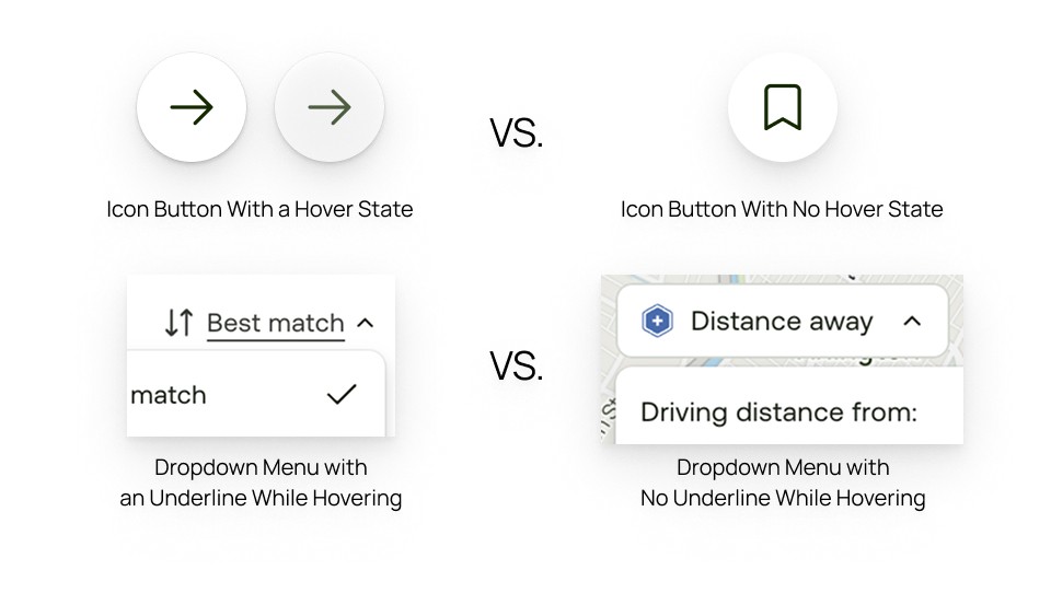
Inconsistent Interactions
Lack of consistency in interactions across components, that causes confusion and an unreliable experience
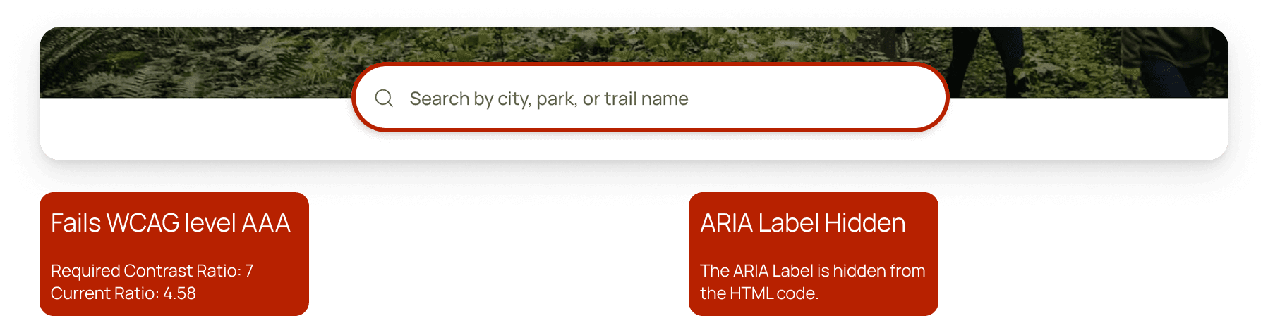
Accessibility Concerns
Lack of Web Content Accessibility Guidelines compliance for color and typography
Challenge
How can we maintain AllTrails' authentic outdoor identity while standardizing design decisions to support growing platform needs?
Despite its strengths, the numerous color variations, component variations, inconsistent interactions, and lack of accessibility provide a disjointed experience for users. Color combinations do not meet Web Content Accessibility Guidelines, which could create barriers for some outdoor enthusiasts.
By creating the Trailblazer Design System, we aim to create a unified and accessible design language that enhances the user’s experience across AllTrails. This standardization ensures the AllTrails experience remains as clear and “well-marked” as the trails it helps users discover. In addition, Trailblazer allows designers and engineers to focus on creating and collaborating on naturally beautiful experiences effortlessly.
Process
To create the Trailblazer design system, we followed a 3-step process:
Deconstruct
We began with a comprehensive audit and analysis of the existing AllTrails UI. This involved cataloging every interface element, documenting inconsistencies, and identifying patterns and opportunities for improvement.
Create
Guided by the Atomic Design methodology, we established guiding design principles and refined the foundational elements of the system, including color, typography, and spacing. We then redesigned core components with a focus on consistency, accessibility, and efficiency. These components were assembled into a Figma UI kit, that was then tested for usability.
Document
Documented the system in ZeroHeight with detailed documentation to ensure seamless implementation, usability, and contribution.
Deconstruct
We started by exploring the AllTrails website thoroughly and then broke down the UI into components and styles.
Interface Inventory
Inspired by the Atomic Design methodology by Brad Frost, we began to document the “bits and pieces” - headers, cards, icons, buttons, carousel, styles, etc - that made up the AllTrails UI. As we went through the process, we started to realize that our scope was too large. We found that there were alot of pages on AllTrails, all with different styles. As a result, we decided to focus on the core flows of the website, such as searching for a trail, looking at the trail features, account management, etc. We intentionally descoped the AllTrails+ specific flows to first establish a solid foundation for the core experience that all users encounter.
Once we went through every single page, we grouped the components and styles in our inventory into categories based on functionality. We also identified any color variants, text styles, and layout and spacing styles, which resulted in a comprehensive Interface Inventory

Create
Based on the interface inventory, we created a UI Kit. As mentioned, we were heavily inspired by the Atomic Design methodology by Brad Frost. Atomic Design is composed of five distinct stages, to help create design systems more deliberately and hierarchically. The five stages are:
Atoms
Molecules
Organisms
Templates
Pages
For this case study, we will solely focus on the creation of Atoms, Molecules, and Organisms.
Atoms
Design Principles
We began by selecting the guiding design principles, keeping nature and the AllTrails’ values and “outdoorsy” brand in mind.
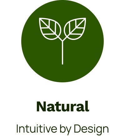
Just as nature provides visual cues that help travelers find their way, our design system ensures designs that feel intuitive and seamless, letting users focus on planning their next adventure.

Just like an individual tree is unique in its own way yet part of a larger forest, each component maintains its character while contributing to a larger unified design system.
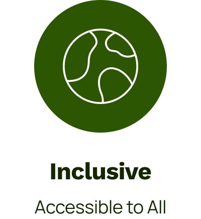
The outdoors belongs to everyone, and so do digital experiences that connect people with nature.
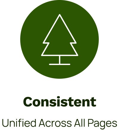
Like a well-maintained trail system, providing reliability through consistent patterns and interactions. This unified approach creates trustworthy experiences across devices, allowing outdoor enthusiasts to focus on their outdoor adventures. The result is a seamless experience as reliable as a well-marked trail.
Foundational Styles
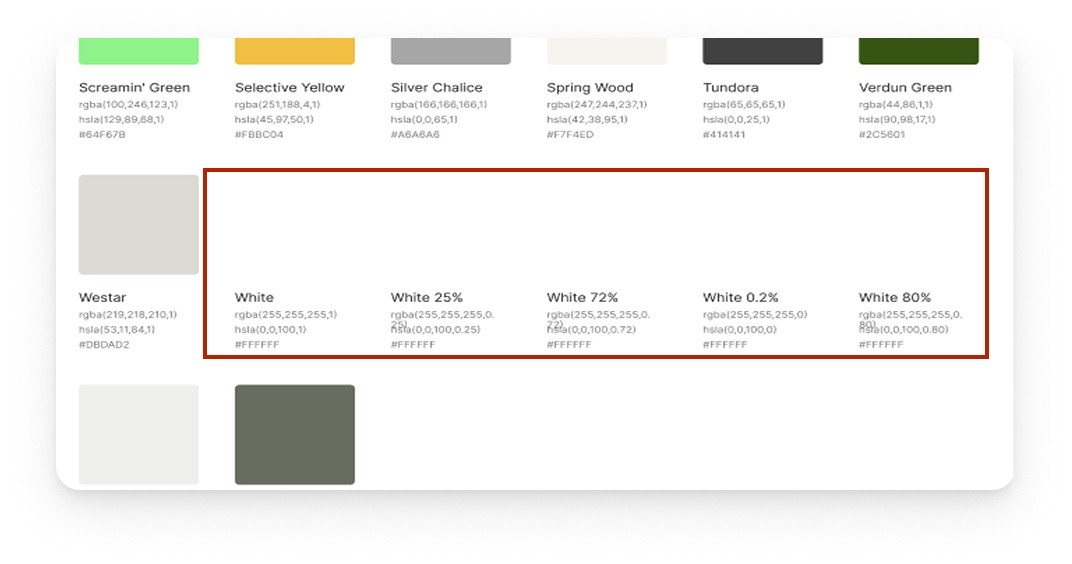
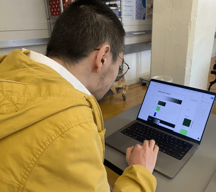
Color
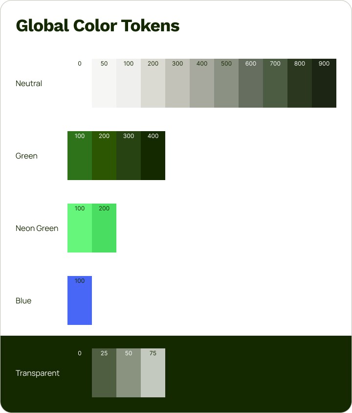
We created a color system that consisted of 18 unique, nature-inspired color styles. We consolidated similar colors and focused on the ones that were being used the most and would meet the WCAG 2.2 AAA contrast ratios when paired. By reducing shares, we aimed to reduce confusion and remove any accessibility barriers.
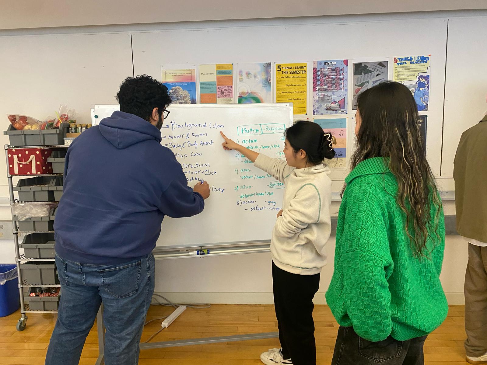
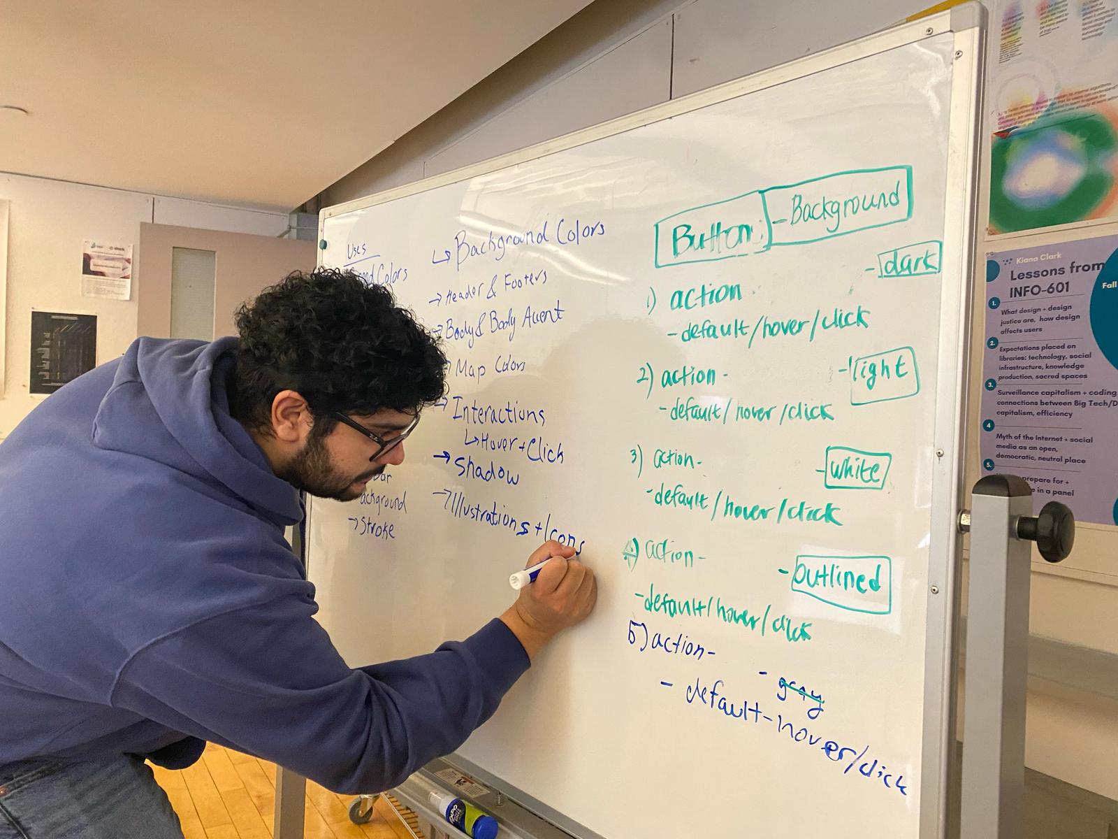
Team Trailblazer deciding on color tokens
Typography
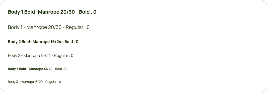
We created a comprehensive typography system for headers, body text, and links. We removed inconsistent text styles to streamline the number of font styles and sizes. We replaced the custom Beatrice header font with Work Sans, an open-source alternative that maintained the friendly, approachable aesthetic while improving accessibility and implementation consistency.
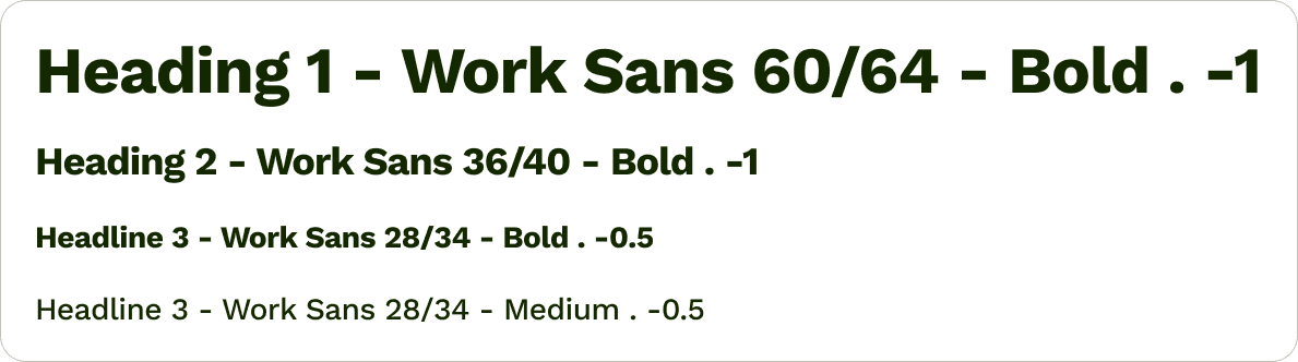
We increased the minimum typography size to 13pts and established a clear type scale with defined uses for each size. This improved readability across devices and ensured consistency and accessibility throughout the UI.
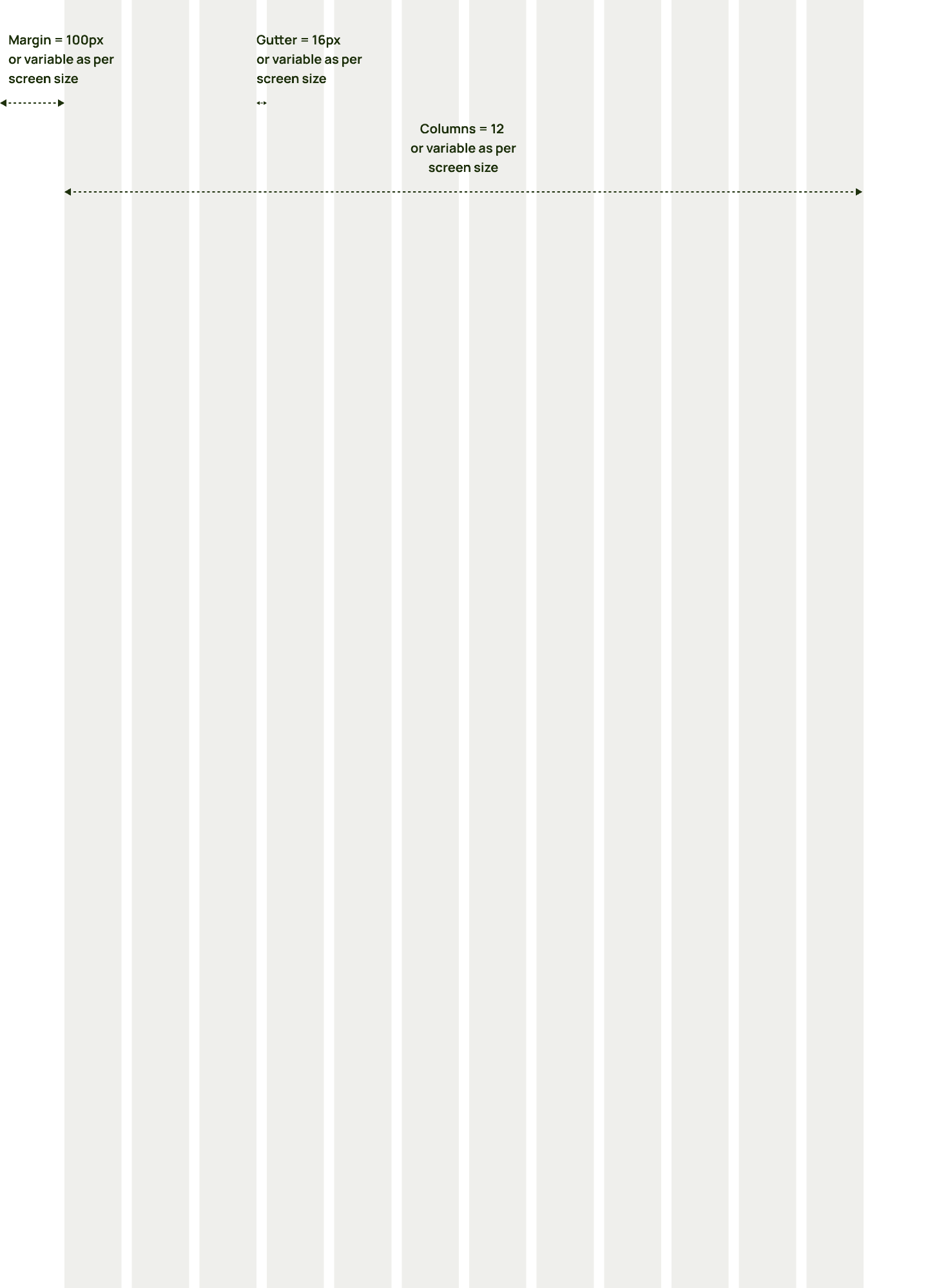
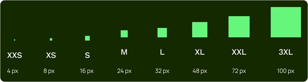
Grids & Spacing
We set a 12-column grid layout with a 100px margin, 16px gutters, and a border radius of 16px. Our spacing system has a base unit of 4px. This layout system ensures clarity, accessibility, and aesthetic balance throughout the UI.
Molecules & Organisms
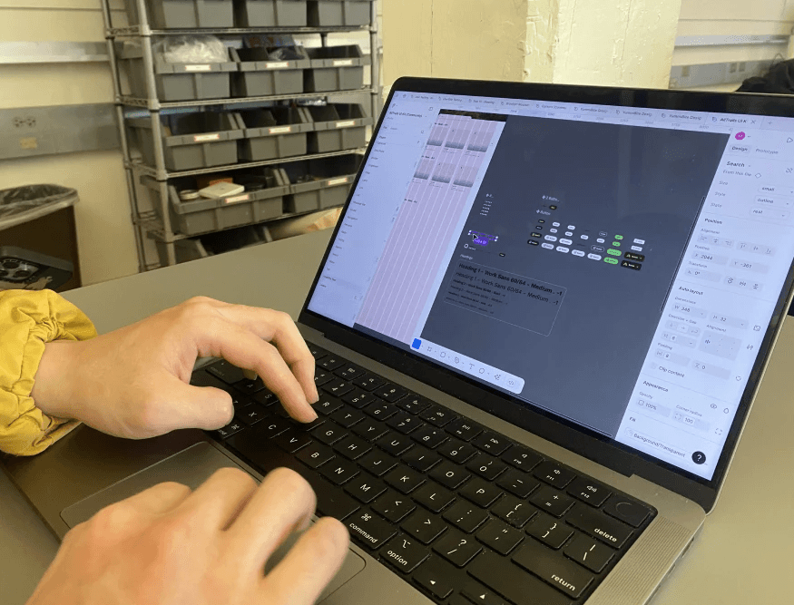
Once we defined the foundation styles, aka the Atoms, we were able to move on to creating the Molecules and Organisms, or the UI components. As mentioned before, there were multiple variations of certain components and there was no clear reasoning behind the variations. As a result, we focused on consolidating the component variations, to ensure clarity, consistency, and efficiency. To increase the use cases for the components, we used Figma variables to nest all the variations and states of the components together.
We began by selecting the guiding design principles, keeping nature and the AllTrails’ values and “outdoorsy” brand in mind.
Molecules
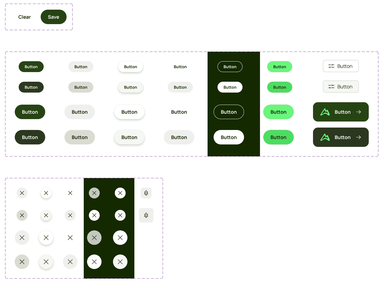
Buttons
We standardized the primary, secondary, and transparent button styles into two sizes and types - small & large and text & icon buttons. We introduced a minimum padding of 16px on the buttons. We improved the accessibility of the text buttons by increasing the minimum font size to 13pts and ensuring all buttons meet the WCAG Level AAA text to color contrast ratios.
Forms - Text Forms
We removed single-use variations in the forms and consolidated them into three text form variants (small, medium, and large) that can be used for any text input - be it user reviews, phone numbers, credit card information, or names. We also increased the minimum font size in the forms to 16pts and introduced a 16px spacing between the text forms and the labels.

Tabs
We found alot of variations of the tabs component that were only being used once or twice. Although the tabs serve the same proposed (navigation), there were different styles on AllTrails. To make it easier for users, we consolidated the tabs into two variants - a section tab and a date tab. For readability across devices, we increase the minimum font size to 16pts.


Organisms
We combined the smaller components, Molecules, like buttons, icons, and menus, to build up the more complex components, Organisms, such as navigation bars, hero sections, and carousels. These Organisms maintain their structure and brand consistency while offering customization options that adapt to different use cases
Navigation Bars
We created two navigation bars, a global navigation bar, and a map page navigation bar. This navigation bar allows users to navigate through the site, while brand presence and orientation throughout the experience.

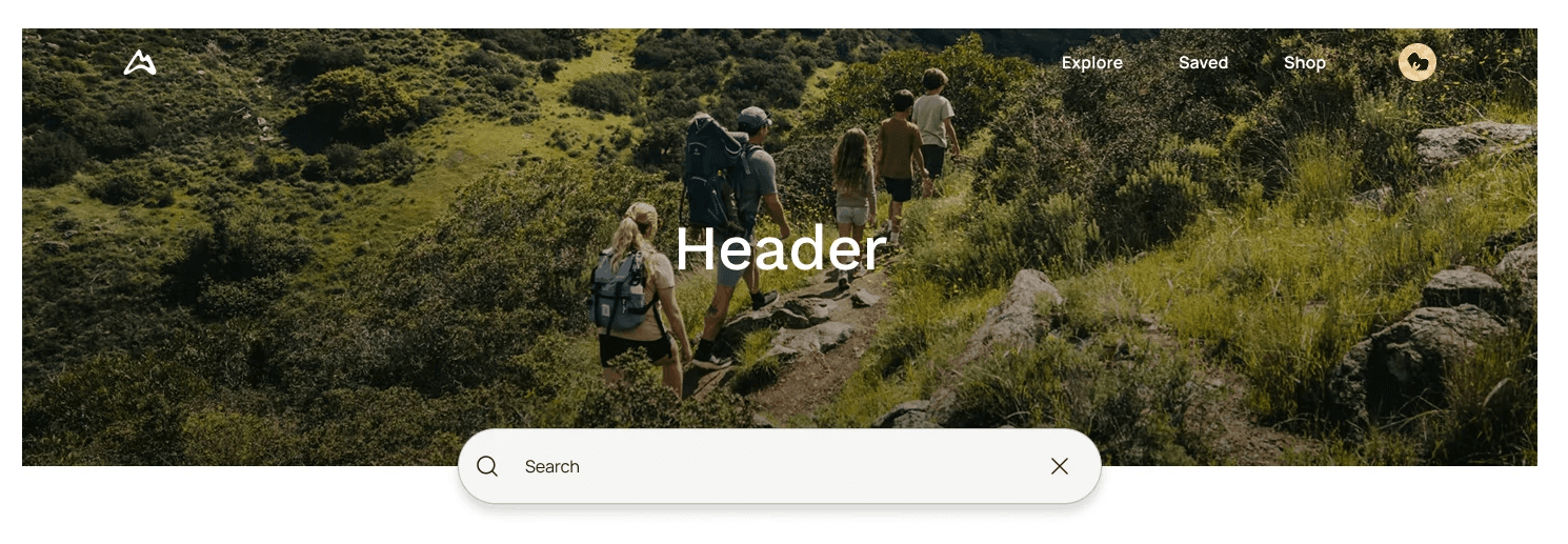
Hero Sections
The hero section serves as a visual entry point that combines the navigation bar, imagery, text, and search bars to create an introduction to the content areas.
Usability Testing
Although we created Trailblazer, we needed to consider that we are not the primary user of this design system. It would primarily be used by designers and developers. In following the User Centered Design process, we needed to evaluate our design system’s usability and effectiveness to ensure that it would provide users with a seamless and intuitive experience.

Since our primary user group is designers, we tested our design system with 2 of them. We asked them to recreate the AllTrails homepage using the Figma UI Kit.
User testing session with Designer
For the most part, we had alot of positive responses, however, we did receive some feedback about requiring additional documentation and confusion with the naming of booleans on certain components. We addressed this through our Zeroheight documentation and reworking the boolean naming to be more clear and concise.
Overall, from our user testers, we found that Trailblazer was comprehensive, intuitive, and accessible.
Document
A design system is not only just a UI Kit, it is also accompanying documentation and resources. We decided to host our documentation on Zeroheight due to its ability to sync with Figma. We created our documentation site to be a comprehensive guide for our design system. Our design system documentation site features our design principles, component usage, and accessibility guidelines, resources on accessibility, communication channels, typography download files, and contribution guidelines.

We included resources to meet the needs of our users - designers and developers. We have a contribution form for anyone to
Report bugs
Improve existing components and guidelines
Request new components or features
Accessibility enhancement
Documentation update

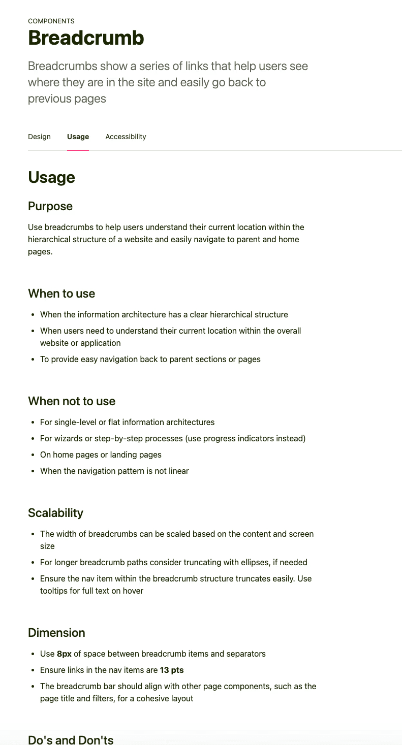
On the component page, we have included an annotated anatomy of the component, the variants available, usage guidelines, and accessibility information. We included information on customization and scalability, to ensure that the components can be adapted to any use-cases, while maintaining their functionality and structure.
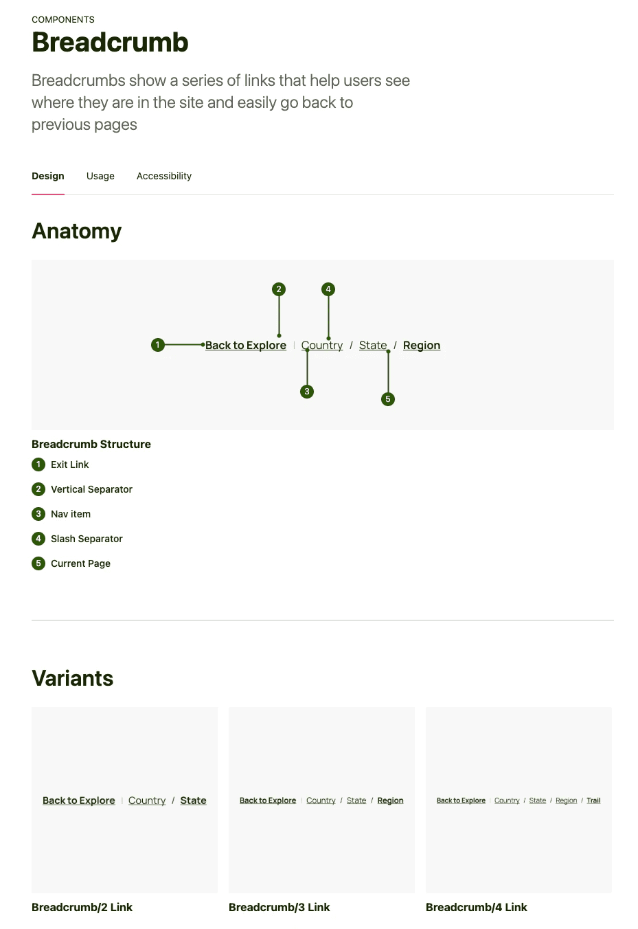
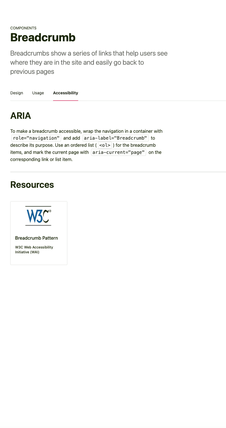
We also provided the users with components “do’s and dont’s” so they understand how to properly use the component. This is also to ensure the user does not unnecessarily customize the component and create inconsistencies in the UI.

Conclusion
This was one of the most impactful classes I have taken. I have walked away from this project and the Design Systems class feeling alot more confident as a designer and collaborator. I am walking away with a much deeper understanding of what a design system is, how to build one, and how to use it effectively. I have also sharpened my Figma skills and, more importantly, strengthened my design language and confidence. One of the most transformative parts of this experience was learning how to write usage documentation for components. This skill has given me the ability to interpret and apply design system guidelines, which is important for implementing components correctly and collaborating across teams. I now feel equipped to contribute to design systems in both practical and strategic ways.
Design Systems Specific Key Learnings:
If I Had to Continue This Project…
Moving forward, a key area of focus will be improving documentation specifically for developers. As primary users of the design system, developers rely on clear, actionable guidance to implement components effectively and consistently. Recognizing this, I would prioritize collaborating closely with engineering teams to understand their workflows, pain points, and documentation needs. This feedback would directly inform improvements to our Zeroheight documentation, ensuring it not only provides technical clarity but also aligns with real-world development practices. By bridging the gap between design and development through better documentation, we can increase adoption, reduce implementation friction, and enhance overall design system usability.
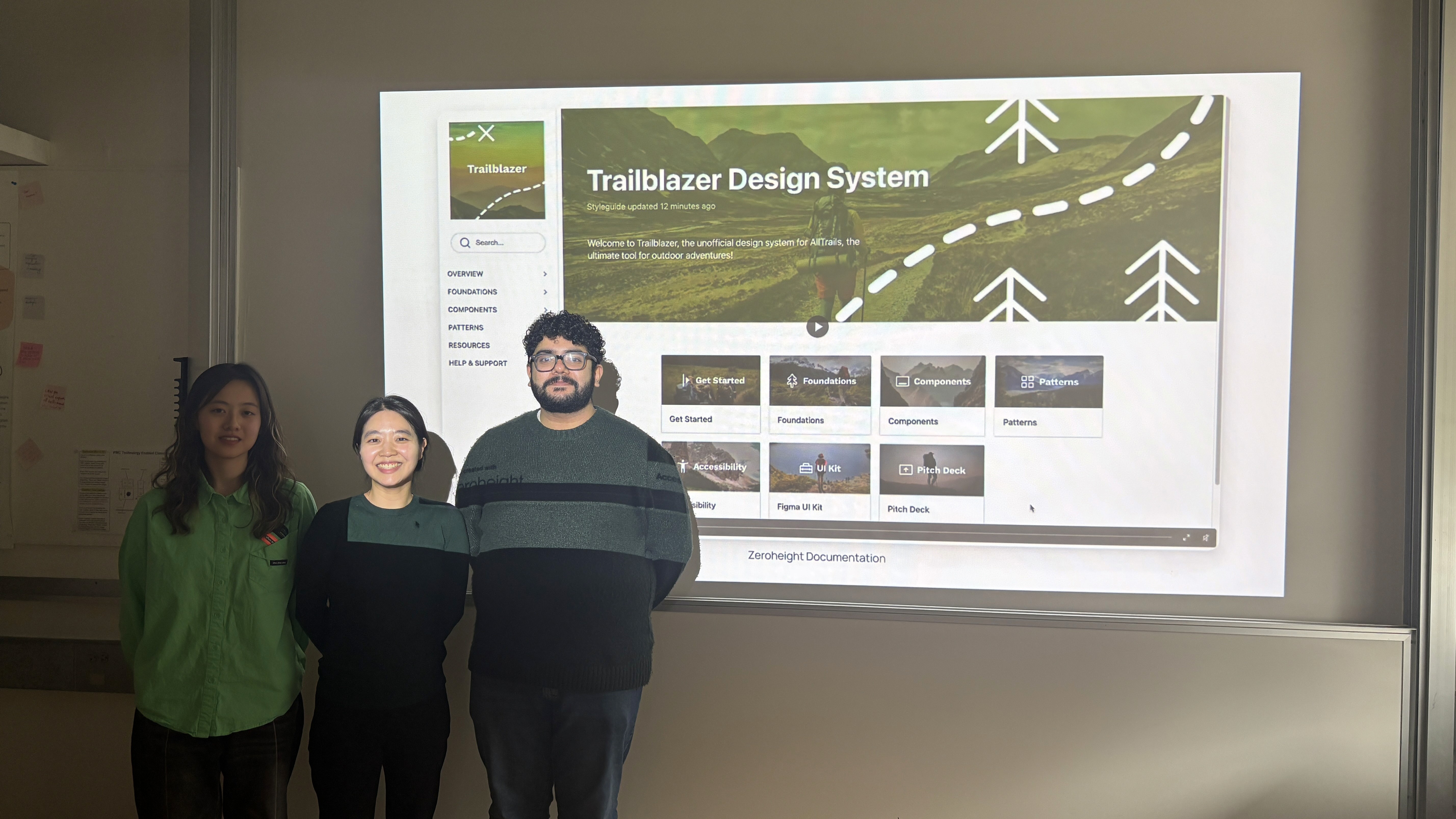
Team Trailblazer :)

Pujan Thaker © 2025
New Jersey, USA