LitLens AR: Bridging Physical and Digital Book Discovery Through Augmented Reality (AR)

Role
AR Product Designer
Timeline
Oct 2025 - Dec 2025
Skills
AR/XR Interface Design
User Research
Full-Stack Development
Tools
Figma
Javascript
A-Frame
Mind AR
React
Tailwind CSS
Google Books API
Physical bookstores offer the joy of browsing and discovering books, but they lack something crucial: the ability to quickly research what you're holding. You can't see community reviews, compare opinions, or access detailed information while standing in the aisle. This information gap pushes readers toward Amazon, contributing to the decline of independent bookstores.
We created LitLens, an augmented reality book scanner that lets you point your phone at any book cover and instantly see reviews, ratings, and community opinions. The goal: give physical bookstores the research power of online shopping without pulling customers away from making in-store purchases.
Problem
The problem: In-store book browsing is slow and fragmented
Key Issues:
Evaluating books takes too long
Users must flip pages or search online, slowing the browsing experience.
Physical and digital worlds are separate
Current apps (Goodreads, BookBuddy, Smartify) do not overlay information directly onto physical books.Accessibility limits participation
Small print, no audio, and poor contrast create barriers for some users.Discovery is inconsistent
Less-popular titles and authors remain hidden without manual searching.
This information gap pushes readers toward Amazon and other e-commerce platforms, contributing to the decline of independent bookstores.
Guiding Question
How might we bring the research power of online shopping into physical retail spaces?
Challenge
Enhancing browsing while keeping it natural and accessible
The challenge was to maintain the tactile and joyful experience of browsing books while providing instant, useful digital information.
Any digital overlay had to:
Be stable and easy to interact with
Highlight the information users care about (reviews, ratings)
Be inclusive and accessible for all users
Integrate seamlessly without breaking the flow of exploration
Solution
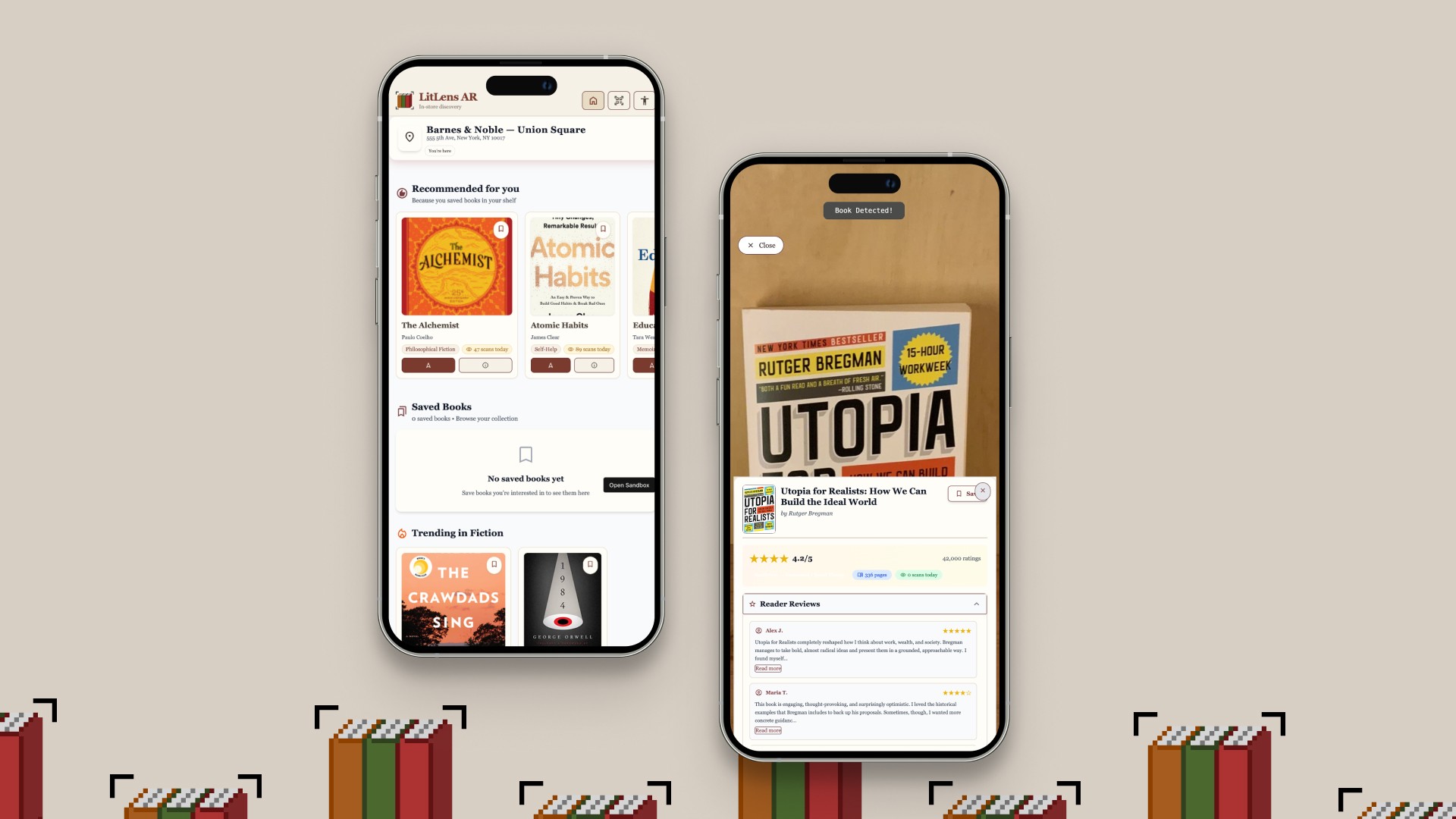
Introducing LitLens AR
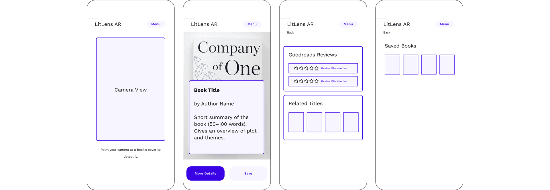
A seamless AR experience that recognizes book covers in real time and displays summaries, reviews, ratings, and related titles. It also provides a curated home feed and accessibility features.
Key Features:

Our Users
We're designing for bookworms

Bookstore browsers ages 18–35

Casual and curious readers

Early adopters comfortable with mobile tech

Users who enjoy the physical experience but want faster decision-making
Process
Competitive Research
Understanding what already exists
We analyzed existing book discovery tools to understand the landscape:

Goodreads offers extensive reviews but isn't designed for in-store browsing; no AR or instant cover recognition

Google Books provides metadata and previews but lacks real-time cover scanning and review prioritization
BookBuddy focuses on cataloging personal libraries, not in-store discovery
Smartify offers visual recognition but are designed for museums
Process
Low-Fidelity Designs & Interaction Flow
Sketching out our idea
With an the idea of AR book-scanning, we got into ideation mode. We began sketching possible UIs and mapping out interaction flows
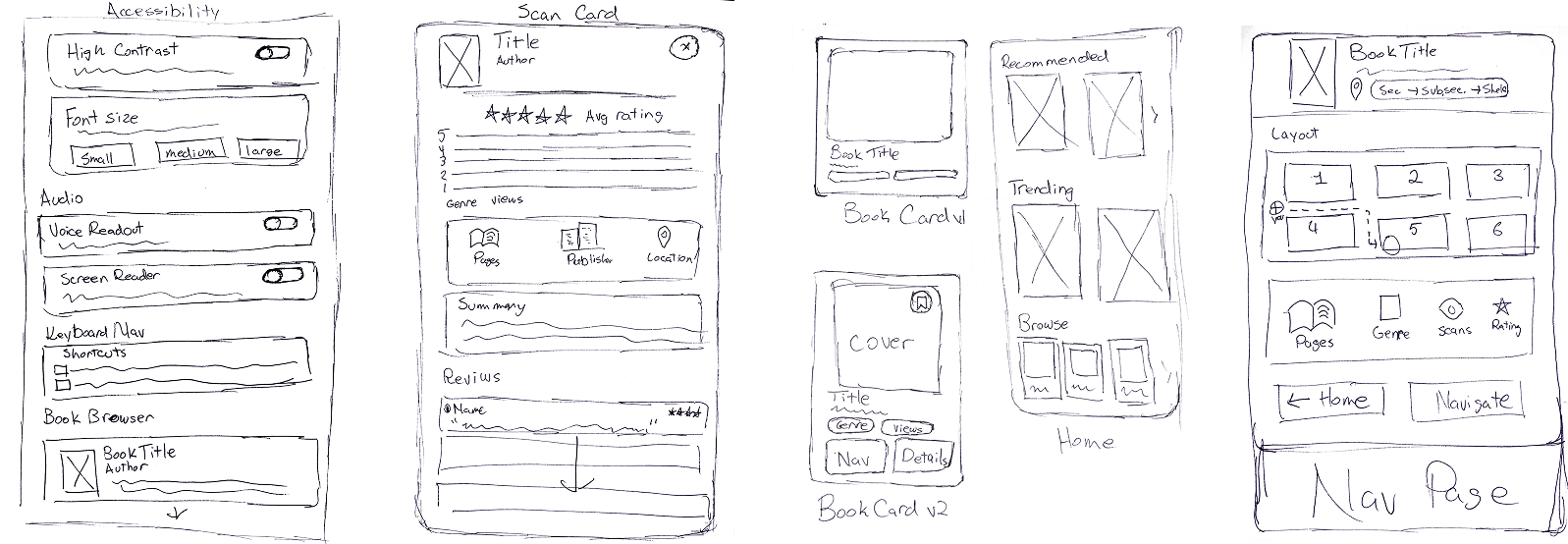
Sketches
Wireframes
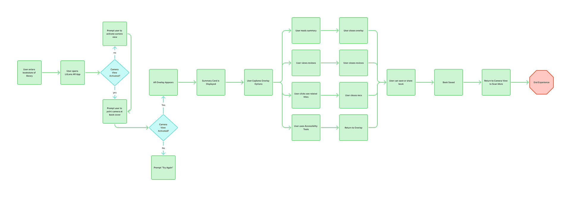
Interaction Flow
Having the interaction flow really helped us map out which features would be triggered by which button or where each element would be on the UI.
Process
Initial Concept: POC 1
Testing the core idea: Can AR book scanning feel natural?
We began with a minimal proof-of-concept to validate the core interaction: Can AR book scanning feel natural and provide immediate value?
POC 1 Features:
• Hiro marker detection (placeholder for book cover recognition)
• Simple AR indicator (spinning blue box overlay)
• Static book information card (Siddhartha by Hermann Hesse)
• Basic overlay with title, author, Goodreads rating, summary, and publisher info
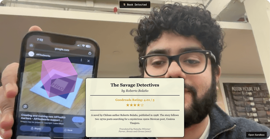
The interface used a cream/beige aesthetic with Georgia serif typeface, aiming for a "library trustworthy" feeling.
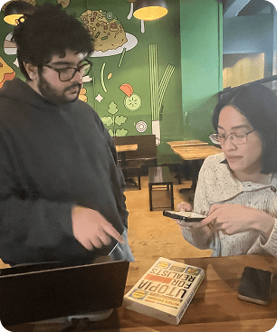
Testing with bookworms
We tested POC 1 with two book browsers using think-aloud protocol. Each session lasted about 15 minutes, and we watched them try the app with physical books.
What worked: Users immediately understood the concept and found it "cool." The novelty of pointing your phone at a book and seeing instant information was compelling.
What didn't work: Beyond the initial wow factor, users questioned what else the app
could do. More critically, the overlay disappeared whenever the camera moved away from the marker, forcing users to constantly re-scan just to keep reading.
One user told us: "This is really cool... but what else does it do? Can I save books? Can I buy them?"
Our decision: The concept was viable, but we needed to evolve beyond a tech demo. Users needed utility, not just novelty.
Process
Initial Concept: POC 2
Adding features (and losing focus)
Based on POC 1 feedback, we expanded significantly for POC 2. We integrated the reviews, added shopping cart functionality, expanded metadata, and polished the visual design.
The problem with doing too much
POC 2 was more feature-complete, but it introduced a critical problem: identity confusion.
The app had become three different products at once:
A discovery tool (browse and learn about books)
A review aggregator (read community opinions)
An e-commerce platform (purchase books)
When we tested POC2, users were unsure if they were shopping or researching. The shopping cart felt disconnected from the bookstore context. Most importantly, adding e-commerce features contradicted our core mission: supporting physical bookstores, not competing with them.
One user captured the problem perfectly: "Wait, why would I add a book to a cart if I'm already holding it in my hands?"
The realization: If we're building this for bookstore discovery, why are we adding features that pull people away from making in-store purchases?
Process
POC 3
Designing for discovery
Solution #1: AR scanning with persistent overlays
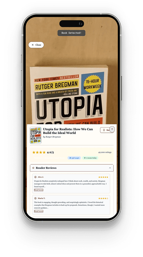
The problem: Users complained that the overlay disappeared when they moved the book out of frame, forcing them to constantly re-scan just to read reviews.
One user told us: "The review panel keeps disappearing. It's frustrating to keep the camera pointed at the book."
Our solution: Once a book cover is detected, the information stays visible until the user manually closes it. No more constantly repositioning books or re-scanning.
Why this mattered: Users aren't in VR, they're in a bookstore trying to read information. Reading reviews requires mental focus, not constant camera aiming. Physical books are heavy; holding them steady is tiring.
Solution #2: Reviews first, everything else second
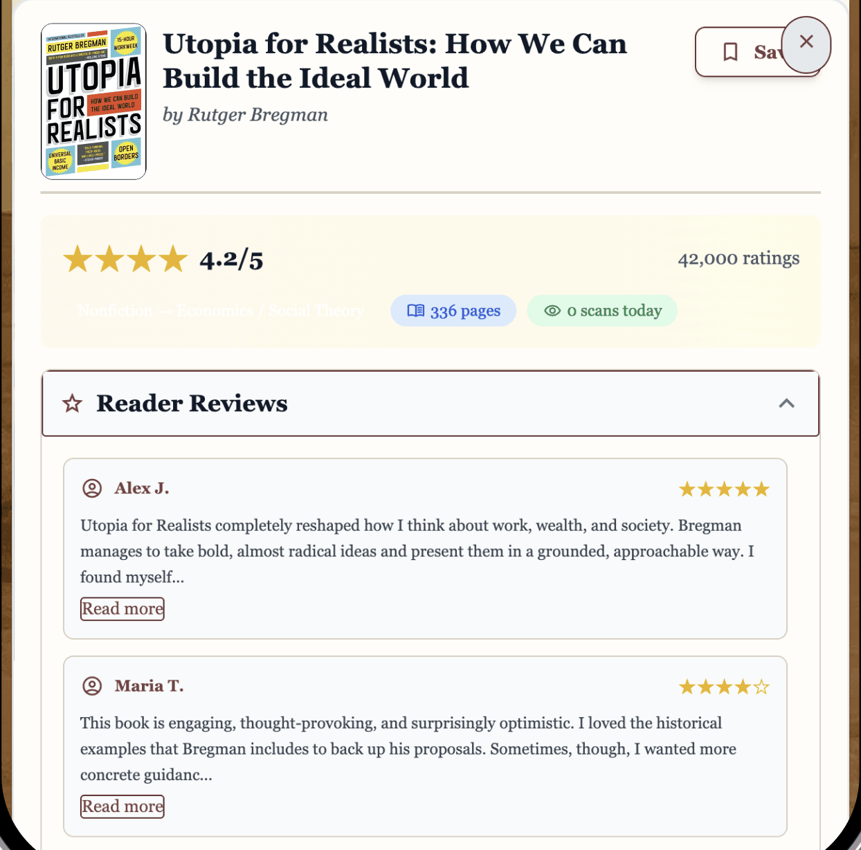
The problem: Users told us they don't read publisher summaries because "they're too wordy." What they actually wanted was honest, unfiltered opinions from other readers.
One user explained: "I don't like reading summaries because they are too wordy, but I would read community reviews."
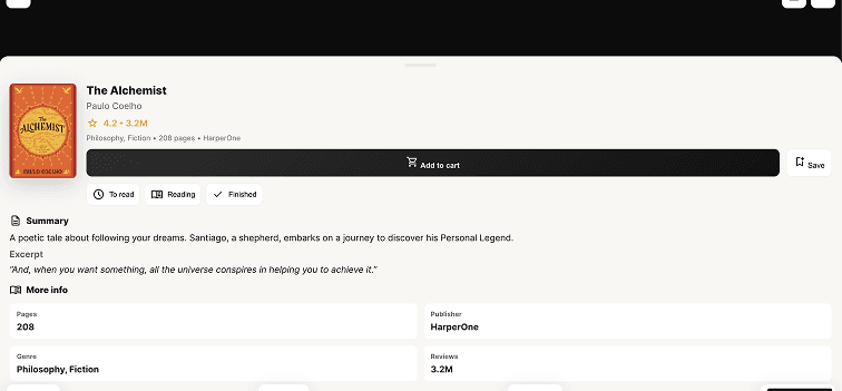
Our solution: We completely restructured the information hierarchy to prioritize reviews:
Quick Stats (rating, pages, scans today)
Reviews (expanded by default)
Reddit Reviews (collapsible)
Summary (collapsible)
Book Details (collapsible)
We styled Reddit reviews to match Reddit's actual visual language (blue usernames, upvote counts, subreddit tags, orange buttons) because familiar design patterns build instant trust.
Why this mattered: Trust is the real product, not just information. Users explicitly told us they trust crowd-sourced Reddit opinions more than curated reviews or publisher marketing.
Solution #3: Collapsible sections for progressive disclosure
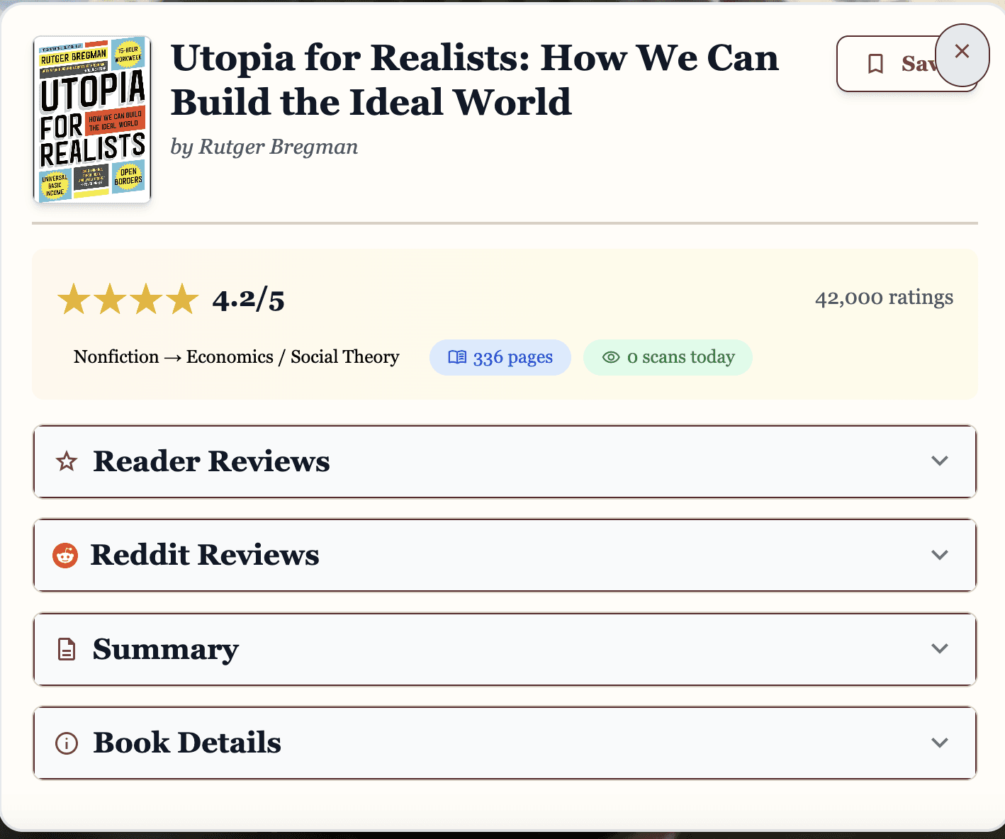
The problem: Users felt overwhelmed by "too much information" and consistently said they don't like scrolling.
Our solution: We broke the interface into expandable accordion sections. Users see only essential information by default (rating and Reddit reviews), with additional details hidden behind clearly labeled sections they can open if interested.
Why this mattered: This reduced cognitive load while respecting users' stated preference against scrolling. Most users only opened Reddit reviews anyway, so hiding other sections made the experience feel lighter and more focused.
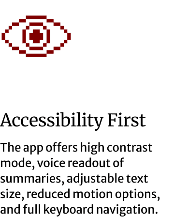
Solution #4: Accessibility features that actually work
The problem: In early testing, users loved that accessibility features existed but they were broken. High contrast mode had no visual feedback when toggled, text resizing didn't apply globally, and color combinations weren't actually accessible.
One user told us: "No feedback when I click high contrast. I'm not sure if it worked."
Our solution: We implemented comprehensive accessibility features:
High Contrast Mode with immediate visual feedback and proper color implementation
Text Resizing (Small/Medium/Large) that applies to all text globally
Screen Reader Optimization with proper ARIA labels and semantic HTML
Full Keyboard Navigation throughout the app
We also ran contrast checkers and fixed all failing color combinations to meet WCAG standards.
Why this mattered: Accessibility isn't a nice-to-have feature. It's about ensuring everyone can use the tool, regardless of visual ability or physical comfort. One user's reaction validated this work: "WOW, accessibility! Really find the accessible tab to be very user-friendly."
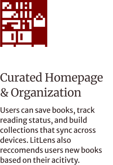
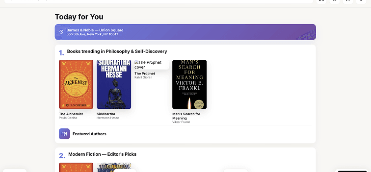
Solution #5: A homepage that feels like browsing shelves
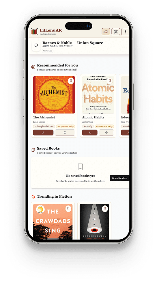
Instead of a generic grid of books, we organized the homepage by genre with a visual shelf metaphor, making browsing feel familiar and library-like.
Each book card displays:
Cover image (fetched from Google Books API)
Title and author
Genre badge
Star rating
Quick-scan indicator
This created a comfortable entry point that mirrors how people actually browse in bookstores: by wandering through sections that interest them.
User Testing
Testing the LitLens experience
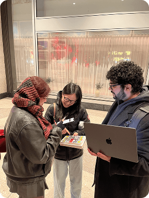
We conducted comprehensive usability testing with 6 participants across 6 individual sessions. Each session lasted about 10 minutes and took place in-person.
What we asked people to do
Explore the home feed and find a self-help or philosophy book
Scan a book and read its summary
Save a book to your wishlist
Adjust accessibility settings (high contrast and text size)
The results validated our simplification
Task success rate: 95% (23 out of 24 tasks completed)
Overall satisfaction: 4.7 out of 5
Likelihood to use in a bookstore: 100% said they would use it
Most valued feature: Reviews (100% of users)
What users told us
On the overall experience: "This feels very library and trustworthy." (MM)
"The UX and interaction is very smooth... 5/5 for that." (GB)
"Oh my gosh! This feature is very cool." (SB)
On reviews being prioritized: "I don't like reading summaries because they are too wordy, but I would read community reviews." (SM)
"Really like that there are reviews and a summary of pages, publisher, and genre." (MM)
On accessibility: "WOW, accessibility! Really find the accessible tab to be very user-friendly." (MM)
Key Learnings
What we learned from building LitLens
Test with the actual context of use
POC 1 used Hiro markers because they're easier to detect. But this masked real-world challenges: poor lighting, book covers, visually noisy environments. We discovered camera positioning bugs late in POC 3 that we could have caught earlier, had we integrated with cover scanning earlier
When using new technology, research… and then research more
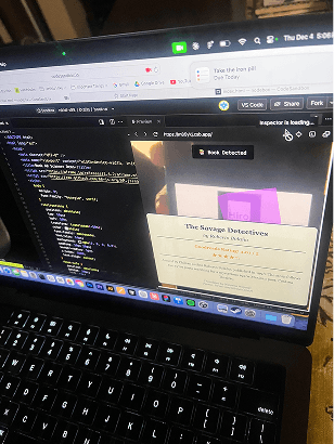
We tried to hard to integrate book cover scanning initially. We tried so many different options, including designing Hiro Markers of the covers. We took a step back and spent some time researching solutions. In the end, we found the Mind AR framework, which we ended up integrating to make cover scanning possible.
Iterative testing saved the project
POC 2 could have easily been our final product. It was functional, polished, and feature-complete. But by testing early and often, we discovered the core experience was unfocused. Iterative testing gave us permission to kill features we'd spent weeks building.